Suggestions de mots clés
Suggestions de contenus éditoriaux
Chargement...
Suggestions littéraires
Chargement...
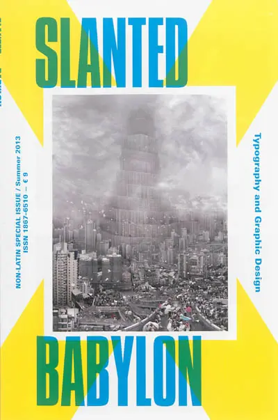
Ce numéro spécial aborde la typographie et le design graphique des polices non latines. ©Electre 2026
During a trip through Poland, I quickly took notice of a signage system which could make every typographer's face flush with anger : The lettering of the tram stop was not designed by an expert in Cracow, but by a display manufacturer. He decided to use kind of a Commercial Script typeface - should probably look historical. Because the wonderful glyph « t » was missing in this type, he did handicrafts and glued. The cultural meaning of language and type and everything which represents typography has been ignored.
I experienced the opposite last year in the Armenian city Oschakan, when I stood at the grave of Mesrop Maschtoz, a moving moment for all participants of Granshan conference 2012. The grave and the church belong to the biggest sanctuaries and pilgrimage destinations of Armenia. The monk who died 1,600 years ago ((...) february 17th, 440) is the patron saint of Armenia.
Museums and institutes are dedicated to him, memorials remember him in the capital city Yerevan and tens of thousands pilgrim to his grave every year. The religious scholar once developed the Armenian written language, an alphabet existing of 36 letters which is conceived as the base of culture and nationality by Armenians. Since the little country got rid of the Sovjet crew in 1991, it is in search of its roots. Mesrop and his alphabet were most identity-establishing : « It's due to him that our nation still exists », numerous Armenians say. Alphabet is identity.
It's very similar in Korea. During the festival Une Saison Graphique in Le Havre I visited an exhibition with works by Anh Sang Soo, who enjoys big popularity. His work is dedicated to the Hangueul alphabet which was developed 500 years ago during the reign of king Sejong and which consists of 17 consonants and 11 vowel signs - developed as an alternative to the Chinese alphabet which was reigning at that time. Soo developed numerous typefaces which connect the Korean tradition with new directions. A vital continuation of history and identity.
These three examples show how tight language is connected with type, culture and identity. The amount of languages in the world is estimated at 6,500-7,000. One third will be dead in the upcoming years - globalization calls for its victims. However, a democratization of type design gives the chance to develop high-quality typefaces also for little languages and alphabets and consenquently strengthens or conceives identity. Why Granshan, with its focus on Non-Latin-alphabets, is such an important conference !
We wish you a lot of fun, Lars Harmsen for the Slanted editorial team
Paru le : 01/01/2014
Thématique : Typographie Revues Graphisme
Auteur(s) : Non précisé.
Éditeur(s) :
Slanted
Collection(s) : Non précisé.
Série(s) : Non précisé.
ISBN : Non précisé.
EAN13 : 4260172810425
Reliure : Broché
Pages : 64
Hauteur: 24.0 cm / Largeur 16.0 cm
Épaisseur: 0.7 cm
Poids: 175 g